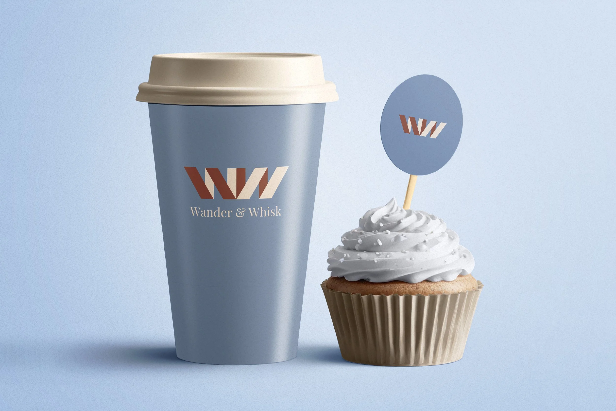
Wander & Whisk
This is a concept logo design. I asked Chat GPT to generate theoritical businesses who needed a logo. Then, I posted a poll on my Instagram page and let my followers vote on which one to create. The WW letterforms represent the overlapping characteristics that a whisk has. The serif font represents the craftsmanship of the coffee. The brown and cream color represent the coffee itself, and the light blue represents the wander vibe the brand is aiming for.